

What is a professional logo?
- Teshia Smith

- Jan 5, 2020
- 4 min read
Updated: Sep 20, 2024
Kudos to all of us who are starting businesses and following our dreams, but lots of us aren't educated on brand identity, specifically, what the role of your logo is.
Many new businesses (especially beauty brands) are asking designers for glam, poppin, glittery, decked out logos. Most new graphic designers are producing that type of work. In the past, in my early days as a designer, I have created glittery logos, but with more years of practice came more knowledge about brand design and how to design in the direction of your brand. When I was a new designer, I would listen to my client and give them what they want, along with what I thought was best as well. People would come to me asking for glitter, and I would deliver that, while also giving my professional opinion and other options as well. I'd always suggest variations and submarks. Variations are “extra” logos that work with your main one, but give more simplicity or just give another look.
Think about Nike, they have their main logo, but they also just use the stripe by itself and you still know what It is. That is what a submark is, and yes you should definitely have one!


Glitter
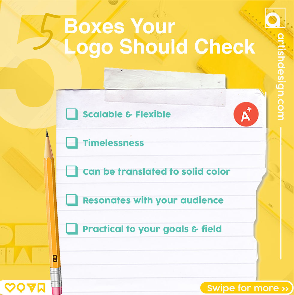
While glitter may seem fun and eye-catching, it lacks professionalism and doesn’t translate well across various mediums. Imagine your logo on something small, like a pen, versus something large, like a billboard—does it maintain its impact in both scenarios? Probably not.
While glitter might look appealing on social media, we need to consider how it translates to the real world. If your brand is focused solely on social media, glitter may seem fitting. However, if you envision your brand in larger, more professional, elegant environments, a glittery logo can come across as cheap and juvenile.
Even if some brands have successfully used glitter logos in store spaces, from a professional design perspective, it often fails to convey the high-quality image you want for your brand.
As you think about your brand’s future, remember to prioritize a design that reflects your aspirations. Let’s create something sophisticated and memorable that truly represents where you want to be.
Colors
A clean, simple logo works!!
A clean, simple logo is often the most effective. While multiple colors can work, they need to be chosen thoughtfully. I've seen logos overloaded with colors that don’t resonate with the brand's tone. For instance, requesting red, purple, pink, and gold for a beauty brand would lead to a cluttered and confusing design.
I recommend selecting one bold color and incorporating subtler shades, such as black or white, to create balance. Monotone logos often prove to be more memorable and scalable. Even if you opt for a multicolored design, having a solid color variation is beneficial.
I recommend selecting one bold color and incorporating subtler shades, such as black or white, to create balance
If you must have more colors, feel free to use them in marketing and further branding items.
Monotone logos often prove to be more memorable and scalable. Even if you opt for a multicolored design, having a solid color variation is beneficial. Our logo development packages include submarks and variations, so that you can have a variety of layouts and colors.


A Graphic versus a LOGO
Many businesses confuse graphics with logos. A graphic is often an elaborate image that includes a background, whereas a logo is a streamlined, memorable mark without any background elements.
People will come to me with a logo that they already have. It’s busy, usually with shadows, textures and 400 colors - but worst of all, has a BACKGROUND. I ask “Were you sent another file, without a background?”, and they say “No, this is my logo”.
A professional logo should always be delivered as a transparent vector file.
A professional logo should be clean, versatile, and suitable for various applications.


Characters; Wrong or Right?
Character logos have been a staple in branding for years. In my professional opinion, they can be effective for cooking brands, lifestyle blogs, restaurants, home renovation, podcasts, YouTube channels, and sports teams, especially when featuring animals or mascots. However, if you envision a detailed illustration or animation of yourself, keep in mind that this may not work well across all mediums. It’s crucial to have a simpler variation with just the text.
While I create character logos, I recommend them primarily for the industries mentioned above or when used as a mascot. In the beauty sector, character logos can be a turn-off; they might unintentionally push potential customers away. If a character doesn’t resonate with your audience or goes against their values, it can lead to disengagement.
If you’re considering a character logo or already have one, I suggest getting a simplified version without the character. This way, you ensure versatility, especially as your brand grows and evolves.
Using Real Images
I cringe. Tish wept. Those designs are more like graphics than actual logos. A logo should be a memorable, simple mark that's vector-based, so it looks great no matter where you use it.
When you throw in real images, like the lipstick or crown below, it can come off as unprofessional and low quality. A good logo should steer clear of those elements because they can clash with the text and don’t always print well on different materials. Less is more, and the cleaner the better!


I personally use to create trendy logos, but as a growing brand focused on expansion, I no longer will design elements that I know can put your business at a disadvantage.
My whole focus is to get you to a higher level via brand identity. I take pride in making sure my client's brands are great on and off of a screen!
Even Apple had to evolve!


Comments