

5 Boxes Your Logo Must Check
- Teshia Smith

- Nov 2, 2022
- 2 min read
Logo development and design is more than just a "pretty" image. If you've read the blog post about what a professional logo is, you'll know all about the do's and don'ts.
Read ahead for the 5 boxes that your logo must check off to be used in the real world effectively. If your logo checks these boxes, you are on your way to successfully growing your brand, reaching the right audience and in the direction to meet your goals.
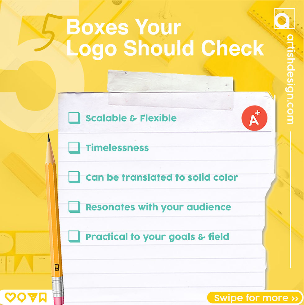
Your logo should be
Scalable & flexible
Timeless
Translatable to solid color
Resonated with your audience
Practical to your goals & field
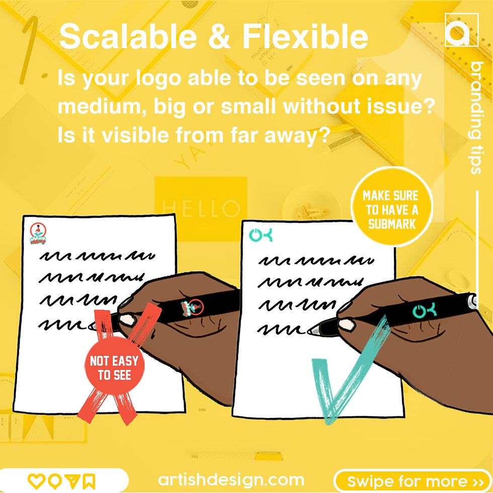
1. Being scalable means that the design is clear enough to be seen up close or far away. If your design is busy, it will be harder to scale and won't quite fit the criteria of flexibility. Simplified logos and marks are perfect for when you will be using your logo on many different mediums. It is wise to have submarks that are minimalistic, if you do have a full main logo.
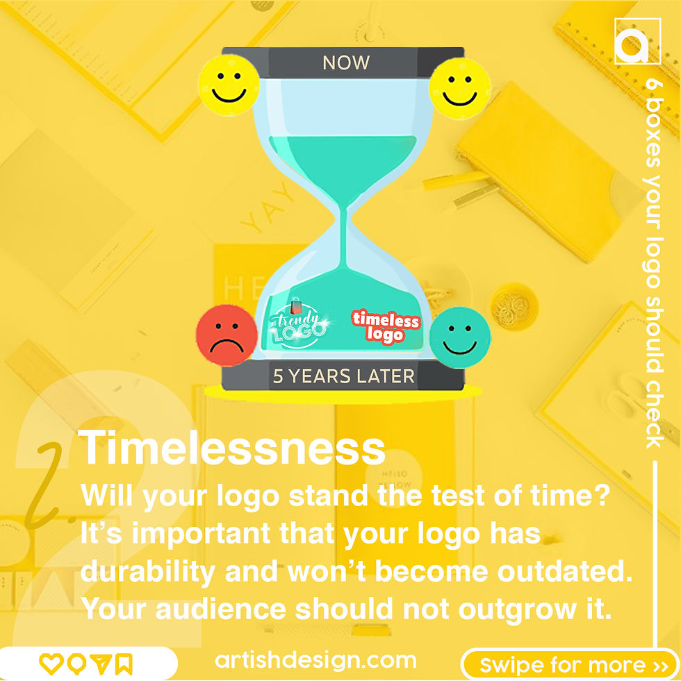
2. Timelessness is so important in branding. We want to make sure our branding won't go out of style or be reminded of trends and popular times. Trendy logos do not last forever, as they usually have popular elements that will soon be forgotten. A timeless logo will be classic!
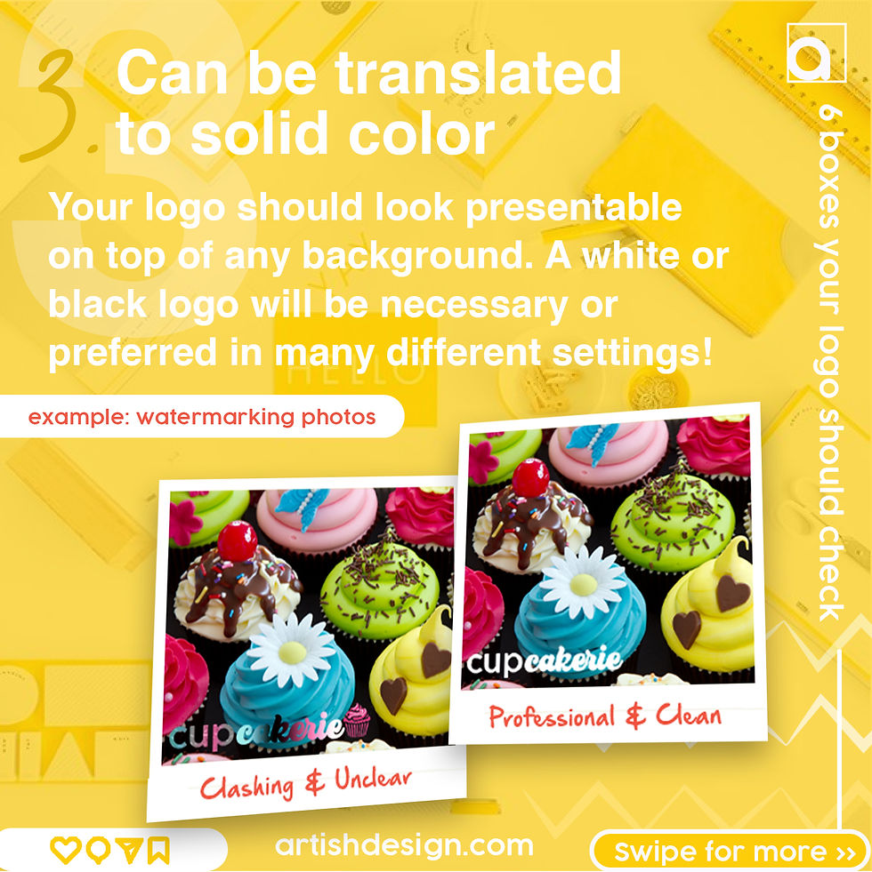
3. As you can see in the example above, it is best to have a white and/or black version of your logo for watermarking and overall a clear depiction of your logo when placed on different mediums. Colorful logos will not look good on any background other than the original background. You will find while furthering your business, that your logo will go on several different backgrounds and thus would not always work in detailed color.
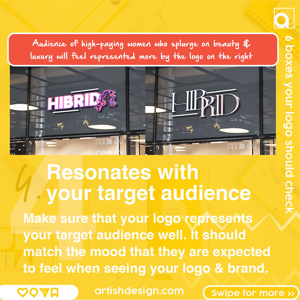
4. Your logo MUST resonate with your target audience. This is a big one that should be regarded first when you are thinking of a logo idea. If you haven't already, do your homework to find out your brand goals and target audience. Your target audience should be what drives the design process, as your designer should know what aesthetics your audience is reeled in by, and will implant that vision into the logo.
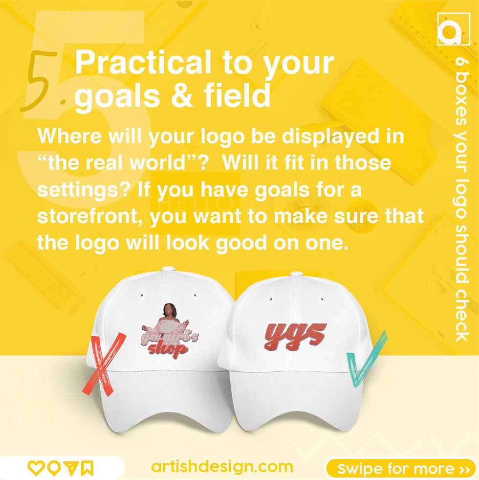
5. It's absolutely imperative for your logo to be practical! it is useless to have a logo that does not transfer well over onto tangible items and things you will be using in your field. With Artish Design logo development, we make sure to provide mockups of your logo on different items and scenes within your field. This is so you can view the logo as it will show up in the real world. Your logo should not only be made for digital purposes and social media. It should fit in with your products, packaging, media, merch, website and more!


Comments